In recent times, it has been found that many business ventures come to halt with their creative solutions when they are restricted by the constraints of the rectangle. As a result, content is trapped with small boxes leading to colossal disappointment. But thanks to CSS Shapes! There are many advantages of using CSS shapes than putting images on your website. If used correctly, they can play a significant role in your progressive workflow. Nowadays there are good Adobe tools that lets you convert a file from PSD to CSS code.
How does CSS Shapes work?
A requirement for applying a CSS shape to an element is that the element must be drifted. It doesn’t work on non-floated elements. UI / UX designers certainly use CSS Shapes in wrapping the content around custom paths, like polygons, squares, ellipses or circles, etc. The shapes are insinuated form images or defined manually.
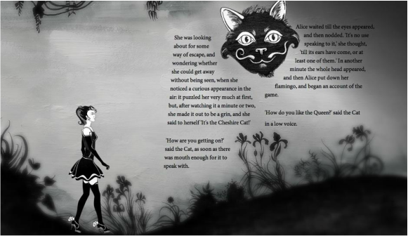
To give you clear thought here is the best example for you.
There are two types of shape properties:
(A) Shape-Outside runs with the shape-margin property and allows the text to flow around a shape.
(B) Shape-Inside runs with the shape-padding property and shelters the text inside a shape.
All in all, there are four basic shapes functions which can be used how to allow the content flow around the element. Apart from this, you can also extract a shape from images with an alpha channel.
The shape-image-threshold property helps in determining the expected shape from the browser. The Pixels with higher alpha value advances for the shape, so you can estimate its value between 0.0 (transparent) to 1.0 (opaque).
Basic Shapes
1. Circle
To create a circle in CSS, we first div and give an ID name to the shape. For example, the ID name to set a circle here is.
<div id=”circle”></div>
For the CSS, just add the height and width. After this give a border radius in it, keeping in mind the half of the width and the height.
#circle {
width: 150px;
height: 150px;
background: #61c409;
-moz-border-radius: 50px;
-webkit-border-radius: 50px;
border-radius: 50px;
}
2. Square
To create a square shape in CSS, just as above, div and give an ID name of the square. For example, the ID name to set a square is.
<div id=”square”></div>
For the CSS of a square, just set up height and width of equal value and provide a value for making it noticeable.
#square {
width: 150px;
height: 150px;
background: #df2dea;
}
3. Rectangle
To create a rectangular CSS shape, set-up a div with the ID name rectangle. For example, the ID name to set a Rectangle is.
<div id=”rectangle”></div>
Now, put a simple width but remember, larger than the height.
#rectangle {
width: 250px;
height: 100px;
background: #388fe8;
}
4. Oval
To create an oval CSS shape, form a div with the ID name oval. For example, the ID name to set an Oval is.
<div id=”oval”></div>
Oval resembles like circle shape. But as the oval is somewhat rectangular in shape it requires a radius that is half of the height
#oval {
width: 300px;
height: 150px;
background: #d32068;
-webkit-border-radius: 150px / 75px;
-moz-border-radius: 150px / 75px;
border-radius: 150px / 75px;
}
5. Triangle
To create a triangle in CSS, again set up a div with the ID name triangle. You need to manage the border property. A simple manipulating of the width will give different results at rotational angles.
#triangle {
width: 0;
height: 0;
border-bottom: 150px solid #e7e412;
border-left: 75px solid transparent;
border-right: 75px solid transparent;
}
There are many advantages of using CSS shapes. One can easily use shapes as a part of the advanced workflow. But remember, every website will not apply this property. But, the technological advancements will turn more sophisticated in near future and it will also helps to convert Photoshop to CSS files.
How does CSS Shapes work?
A requirement for applying a CSS shape to an element is that the element must be drifted. It doesn’t work on non-floated elements. UI / UX designers certainly use CSS Shapes in wrapping the content around custom paths, like polygons, squares, ellipses or circles, etc. The shapes are insinuated form images or defined manually.
To give you clear thought here is the best example for you.
There are two types of shape properties:
(A) Shape-Outside runs with the shape-margin property and allows the text to flow around a shape.
(B) Shape-Inside runs with the shape-padding property and shelters the text inside a shape.
All in all, there are four basic shapes functions which can be used how to allow the content flow around the element. Apart from this, you can also extract a shape from images with an alpha channel.
The shape-image-threshold property helps in determining the expected shape from the browser. The Pixels with higher alpha value advances for the shape, so you can estimate its value between 0.0 (transparent) to 1.0 (opaque).
Basic Shapes
1. Circle
To create a circle in CSS, we first div and give an ID name to the shape. For example, the ID name to set a circle here is.
<div id=”circle”></div>
For the CSS, just add the height and width. After this give a border radius in it, keeping in mind the half of the width and the height.
#circle {
width: 150px;
height: 150px;
background: #61c409;
-moz-border-radius: 50px;
-webkit-border-radius: 50px;
border-radius: 50px;
}
2. Square
To create a square shape in CSS, just as above, div and give an ID name of the square. For example, the ID name to set a square is.
<div id=”square”></div>
For the CSS of a square, just set up height and width of equal value and provide a value for making it noticeable.
#square {
width: 150px;
height: 150px;
background: #df2dea;
}
3. Rectangle
To create a rectangular CSS shape, set-up a div with the ID name rectangle. For example, the ID name to set a Rectangle is.
<div id=”rectangle”></div>
Now, put a simple width but remember, larger than the height.
#rectangle {
width: 250px;
height: 100px;
background: #388fe8;
}
4. Oval
To create an oval CSS shape, form a div with the ID name oval. For example, the ID name to set an Oval is.
<div id=”oval”></div>
Oval resembles like circle shape. But as the oval is somewhat rectangular in shape it requires a radius that is half of the height
#oval {
width: 300px;
height: 150px;
background: #d32068;
-webkit-border-radius: 150px / 75px;
-moz-border-radius: 150px / 75px;
border-radius: 150px / 75px;
}
5. Triangle
To create a triangle in CSS, again set up a div with the ID name triangle. You need to manage the border property. A simple manipulating of the width will give different results at rotational angles.
#triangle {
width: 0;
height: 0;
border-bottom: 150px solid #e7e412;
border-left: 75px solid transparent;
border-right: 75px solid transparent;
}
There are many advantages of using CSS shapes. One can easily use shapes as a part of the advanced workflow. But remember, every website will not apply this property. But, the technological advancements will turn more sophisticated in near future and it will also helps to convert Photoshop to CSS files.
 RSS Feed
